I started watching these charts a couple months ago and, after the latest round got released, decided I’d post them here as a “canary in the coal-mine” alert.
These charts tell me that the folks at the Fed are in uncharted territory. Their own charts tell the tale…
This first one, “non-borrowed reserves of depository institutions” shows a quite startling plunge over the last three months. If I were running the family checkbook and looking at this chart I’d be saying “Marcie, I think we’re broke.” Here’s where I started;


and here’s the latest version;

Click HERE if you want to look at the current version of this chart. I sure hope it looks better when you visit their page.
Here’s another one — pretty much the converse of the first picture, but this series goes a lot further back. Yep, another huge swing. The thing that I like about this series is that it goes way back in time — to long before the great banking crash of 1930/31.

and here’s the latest version;

A couple months ago, you could see all kinds of wiggles in the chart. Now it’s just a flat line with a giant upsurge at the end.
Click HERE to see the current version of this chart.
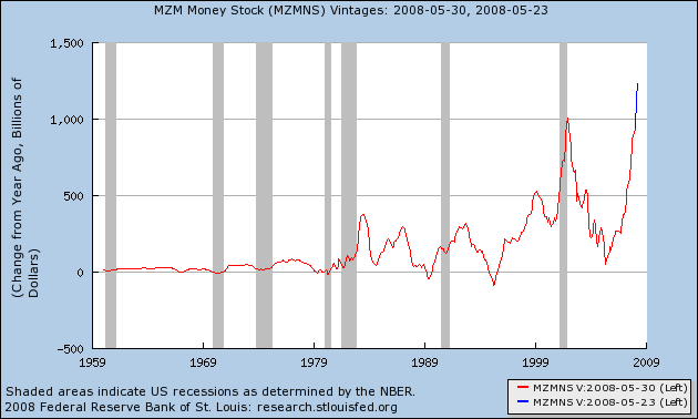
Here’s another view. This is the change in the size of the money supply, compared to last year. As you can see, the Fed is pushing this up pretty hard right now.
Click HERE for the page that I used to generate this chart — unfortunately, I can’t automate the “current version” display.
I’m interested in these charts because this represents a huge “tinkering” effort by the Fed. I hate those. I worry about unintended consequences (maybe a lot of inflation?). I worry that the banks are masking a huge weakness paving the problem over with money borrowed from the Fed.
Click HERE for a link to a bunch of charts like this from the St Louis Fed. Once you’ve clicked on a series that you’re interested in, look for a link that says “current series in FRED” to see the charts like these.
For the first time in my life, I’m buying gold. Click HERE for a link to BullionVault – that’s where I’ve landed after conducting all my usual obsessive-geek research. They’re a great gang, I love their systems, I appreciate being able to actually own the metal and I think the opportunity to choose between vaults in 3 countries rocks. I never ever thought I’d get to this ridiculous place. But this is nuts, people. I’ll keep adding on to this post as events unfold.
Related links
April 8, 2008 — Paul Volcker (Fed chair during Carter) blasts current Fed policy — click HERE — Summary: The Fed has lost sight of its mission to defend the dollar.
April 27th, 2008 — “Private Profits and Socialized Risk” — Ben Stein (NYTimes) highlights an April 8th speech by David Einhorn to Grant’s Spring Investment Conference. Click HERE for the NYTimes “Cliff Notes” and HERE for the full transcript (in PDF format). Summary: Wall Street firms are incented to take on unhealthy levels of risk, using capital reserves that are valued (and rated) by the firms themselves. Regulators snooze.
May 1, 2008 — Iran stops dollar-based oil trading, switches to Euros and Yen — Click HERE. Summary: Partly political of course, but also partly because of the continuing weakening of the dollar. This will be big trouble if the “walk away from the dollar” trend continues. Confirms Volker’s view.
May 1, 2008 — Kevin Phillips publishes “Numbers Racket, why the economy is worse than we know” in Harpers Magazine. Phillips contends that economic measures like the Consumer Price Index (CPI) and unemployment statistics have been gradually “sweetened” over the past 30 years, giving investors a too-positive view of the economy. Click HERE for the article.
May 2, 2008 — You recall those charts at the top of the page? Sure you do. Well today central banks (the Fed, Britain and Switzerland) expanded that program. Next month’s chart ought to be a hum-dinger. Click HERE Summary: The Fed added $25 billion to the $50 billion they’re already lending to non-bank banks, and also loosened the standards for what they’ll accept as collatoral for those loans.
May 7, 2008 — WSJ story about a Fed proposal to pay interest on required reserves. Interesting note; the article mentions that since last July the Fed has “replaced half the roughly $800 billion of Treasurys it held last July with loans to banks and securities dealers.” The pictures at the top of this page only show about $100 billion of that implied $400 billion. Click HERE
May 14, 2008 — Karl Denninger writes a story about these same charts. My observation in yesterday’s Geezercast is that this is starting to feel a lot like the Y2k crisis — there are “pollyannas” who are motivated to keep things calm, and “doom and gloom” people who are predicting disaster. And precious little credible information in the middle. Karl is definitely in the Doomer camp. I think his analysis is wrong, in that he doesn’t include *both* charts that I have here. But I’m not sure about the implications. Click HERE for Karl’s take.
May 14, 2008 — This American Life does a great episode called “The Giant Pool of Money” which describes the mortgage crisis in the voices of the participants. Absolutely fabulous radio. Click HERE for a link to the podcast.
May 28, 2008 — The New York Times comes out with a “looking back” piece. Click HERE for the story. One of the problems with situations like these is the chasm between the “doom and gloom” perspective and the “Pollyanna” perspective (reminds me of the Y2k crisis). Like Y2k, “muddling through” seems to work in many cases.
May 30, 2008 — click HERE for a gloomy FDIC (the people who insure banking deposits) report on the state of the banking industry. Report headlines: Industry Earnings Decline 46% from Year-Earlier Level, Loss Provisions Absorb a Higher Share of Revenue, Troubled Loans Accumulate in Real-Estate Portfolios, Lending Growth Slows, Fourth Quarter 2007 Earnings Are Revised Below $1 Billion. Click HERE for a chart that summarizes the trouble — Reserve Growth Has Not Kept Pace With Rising Noncurrent Loans.
June 8,2008 — The Economist publishes a gloomy story — their take is that the credit crisis is far from over, unlike the cheerful prognostications from Wall Street. Interestingly they mention that the Fed is intending to end the the credit facility (reflected in the charts at the top of the post) by September. Given where the total is at (over $100 billion at this writing), that seems an equally big disruption, in the opposite direction. Click HERE for the article.
July 11, 2008 — Fannie Mae and Freddie Mac started to unwind this week. This is a situation like the Bear Stearns run that triggered this article. Except bigger — because these two companies back about half of all mortgage debt. Click HERE for an early NYTimes story, and HERE for a grumpy reponse (Bloomberg) to the Fed’s proposed bail-out plan.
Sept 7, 2008 — Fannie Mae and Freddie Mac wind up in US government hands. Click HERE.
Sept 15,2008 — Lehman Brothers is bankrupt after frenzied negotiations, Merril Lynch is bought by Bank of America, AIG is in trouble. Click HERE.
Sept 17, 2008 — A bad day in the markets today. Morgan Stanley and Goldman Sachs are in trouble, credit markets have seized up, international markets (like Russia) are hurting too, a major money-market fund “breaks the buck”, US T-bill yield is at levels not seen since Pearl Harbor — Click HERE to read a representative story from the Financial Times blog. Gold was is up almost 10% for the day.
Oct 10, 2008 — My goodness what happens during a few weeks of vacation. Marcie and I toured New Brunswick and Nova Scotia and just got back. To a mess (stocks are down 20% for the week this week, and headed lower). Click HERE to read Paul Volker’s thoughts about what we need to do.